If you have an eCommerce platform, then you’ll already know conversion rates are key. What percentage of the visitors to your site become customers? The number can vary, and it’s important that you do everything within your power in order to maximise it.

Are you happy with your current conversion rates? If the answer is no (and it should be!), there are many category merchandising techniques you can use to increase your them – let’s look at 5 suggestions.
There are, however, things to consider with this technique. It would only work on desktop, so consideration of what device your users browse on would be necessary. The feature would also need to be well built to ensure the user isn’t forced to load images they won’t use.
Loading unnecessary images on one page decreases overall speed, which would adversely affect your conversion rates. Is the second image loaded on demand or in the background? If you work with a team who understands the importance of developing with context in mind, then you won’t have anything to worry about.
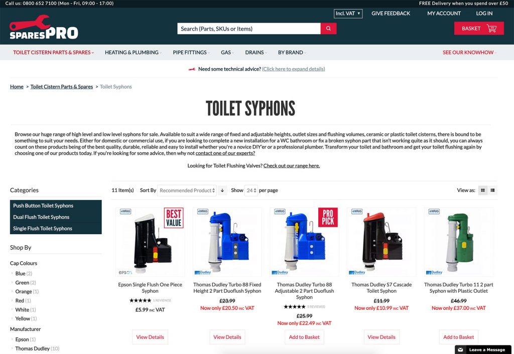
Where there are a wide variety of products which haven’t been split into further subcategories, a user coming to the category page could perhaps think there are less products than there are.
You want the user to explore the full range you have on offer. Adding a count of products to the title within the header would signal to the user that there are lots of products, encouraging them to browse through the entire page. It might also encourage your customer to use filters to narrow down their search, increasing the possibility that they find the product they are looking for. Both of these things would mean an increase in your engagement with your site.
The design and build of this feature must be carefully considered, especially with regards to SEO. The count of products should not be part of the H1 category title as it is irrelevant to your target keywords for the page, and could weaken your ranking if you were to accidentally include it.
We see Magento as the best eCommerce solution for businesses who want to differentiate their customer experience, but that doesn’t always mean its features will give you optimal conversion rates straight out of the box. For example, Magento’s default Luma theme displays 4 images across the product category page You could consider instead showing a row of 3 images instead of 4 to increase the size of the images on screen.
This would provide a greater amount of detail, allowing a user to see more of the product before clicking through to the product page. Likewise, on mobile you could consider whether it would be better to show 1 or 2 products per row.
With this technique, the context of how you sell your products is vital in understanding how to display them. Large images do provide more detail, but will your potential customer be put off by having to scroll more? Providing a solution that fits your users will lead you to an increase in conversion rates.
If a customer knows the product they wish to buy, then the typical journey would be to click through to the product page and then add the product to the basket. However, if the product they wish to buy is out of stock, then this ends the user journey in frustration.
Often, the stock status is the only piece of information needed to proceed to purchasing. Adding either an ‘in stock’ message or filter to products on the category list page can encourage customers to click add to basket on the category page without having to visit the product page. It takes away the last barrier to purchase and speeds up the user journey, which would in turn increase conversion rates.
This technique is a natural progression of the ‘in stock’ message. Magento allows for swatches from which the user can quickly configure their product without having to visit the product page at all. These can be for everything from stock and sizes available, to product colours. Including these swatches on your category product page shortens the buyer journey, especially for those potential customers that might wish to see many options at a glance.
If a customer avoids the annoyance of having to click through to the product page only to see that the product they want is not available in their size, then that creates a better user experience overall. If you improve user experience, you increase conversion rates.
Will these techniques really increase your conversion rates? The answer is likely yes, so long as you make sure that your eCommerce platform is in the hands of a team who consider the context of your business and how your potential customers will experience your website.
If you can guarantee that, then there’s no reason these 5 category merchandising techniques won’t increase conversion rates. We’d love to help you find out if they could, feel free to contact me to learn more about how we can increase your eCommerce sales.
Iterative eCommerce Growth
Magento integrations
International eCommerce


